ExpressViews can be styled in a variety of ways:
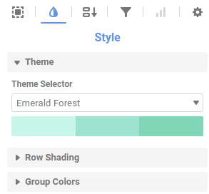
- Click the Formatting and Style icon in the right pane to make universal report styling changes such as Theme.
- Click the Selected Section icon and choose a section of the report to make formatting changes.
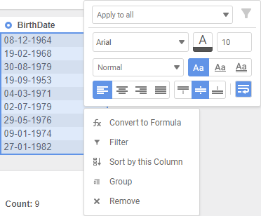
- Right-click a section of the report for interactive editing that includes formatting options and data structuring options such as sorting, grouping, and filtering. Learn more about interactive editing in ExpressViews here.
Using a premade theme
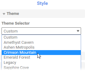
If there are any available, you can select a premade theme to use for the ExpressView, or to use as a baseline for further customization. On the Formatting page, click the Theme tab. Then select a theme from the Theme Selector list:
Legacy
This is the default theme.
Custom
This option indicates that you are not currently using a premade theme.
Selecting a premade theme overrides any custom styling you have. Be sure to save the ExpressView first, so that you can retrieve your styling if you accidentally override it.
Selecting a premade theme
Styling data cells
Cells, columns, group headers, and group footers can be styled using the Report Formatting and Style pane, the Selected Section pane, or by right-clicking sections of the report. Each of the three options is used for different purposes:
- Universal report styling changes such as theme, row shading, and group colors are made using the Report Formatting and Style pane. See the following two sections for more details on row and group colors.
- The Selected Section pane is used to make data format changes such as Date or Number format or to create formulas in a column. It can also be used to style multiple cells or sections at one time when used with the CTRL key. To use the multi-select feature, click the Selected Section icon, hold the CTRL key while clicking all of the desired sections, and then make changes in the right pane.
- To make styling changes to independent sections, you can right-click specific areas and use interactive editing or you can click the Selected Section icon, click the appropriate section, and make changes in the right pane.
Changing data row colors
The background colors for the data rows can be customized, and you can set the pattern by which the colors alternate. This affects every data section in the ExpressView.
To set the background colors:
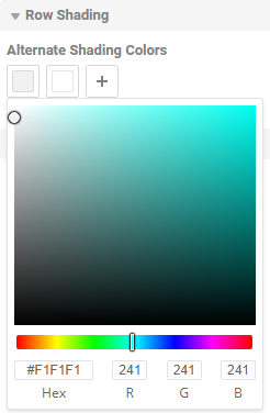
- On the Formatting page, click the Row Shading tab. By default there are two colors which alternate every other row.
- Choose the number of colors that you want to alternate between:
- To make all rows the same color, click to delete all the colors except one.
- To make rows alternate between more than two colors, click to add more colors.
- Enter a hex value or use the color picker to set each color.
Choosing data row colors
Changing group colors
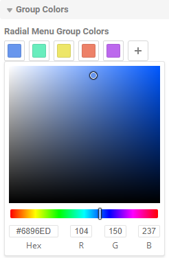
The headers and footers for group columns are prefixed by a different color depending on the level of grouping. These colors can be customized, and you can set the pattern by which the colors alternate. This affects every group header and footer in the ExpressView.
To set the group level colors:
- On the Formatting page, click the Group Colors tab. By default, nested groups alternate between four colors.
- Choose the number of colors that you want to alternate between:
- To make all group levels the same color, click to delete all the colors except one.
- To make group levels alternate between more than four colors, click to add more colors.
- Enter a hex value or use the color picker to set each color.
Choosing radial menu colors
